Brochure Dimensions
With the software available today, almost anyone can print out a brochure.  However you need to know the correct brochure sizes for it to be effective. Content matters yes, but the dimensions are just are critical.
Standard Sizes
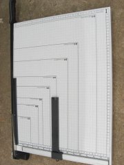
The typical size is 8.5 x 11”. This holds true for both bi and tri fold. However, other sizes are available. These include 4.25 x 5.5”, 5.5 x 8.5”, 8.5 x 14” and 11 x 25.375. Some brochure makers also offer customized types. The increments usually go up by 0.25”. Aside from tri fold and bi fold, others offer Z fold options.
For most occasions, the 8.5 x 11” dimensions will be sufficient. This layout is recognized by virtually all printers. If you’re going to use other brochure sizes make sure the graphics and layout will print correctly.
Making a Brochure
Computer programs have different ways for making brochures. But the following can serve as a general guide. First select the size and shape of the paper. If the brochure will be printed by a commercial service, let them know if the page will bleed (print right to the edge).
Now you have to set in the margins. For bleeding pages, the edge is 1/8 of an inch. Use the grid and guideline features of your software to align the contents. Now add the images and text.
While you’re adjusting the brochure size and other elements, put some dummy text in the page. This allows you to see what the layout looks like without typing in anything.
Font Size Considerations
It’s best to use just two font variants in the layout. The header and main body text should use different fonts. Pay careful attention to the font size. You want it to be noticed, but don’t
make it too large it overpowers the graphics.
When you’re done, save it as a template or master copy. Try using well known fonts so people will have an easier time reading it. Two of the most popular are Arial and Times New Roman.
Tips and Suggestions
The brochure size is just one aspect to consider. To make the brochure effective the cover must be eye-catching. It’s the first thing people will see, so the text and graphics must give an idea of the contents. The text should be written in short yet informative sentences. The text must be laid out clearly.
Colors must be used effectively. If you’re making a travel brochure, use illustrations depicting the ocean, trees, white sand etc. The photos should be clear and inviting.
You can also add contact information, maps and highlights of the place. Don’t just add pictures here and there. The pages need to have a consistent theme running through it.
It’s okay to look at other brochures for ideas on the layout. However you’ve got to make it your own. People won’t notice your brochure if it looks like the others.
If you use the right brochure size, it can turn into an effective marketing tool. The attention you give the overall design will produce the effect you desire.